Usability test
Termomix TM5
Short overview
This study aims to test the cognitive activity in performing certain tasks with the Termomix and to come up with new design concepts to either enhance the cognitive experience or eliminate the cognitive stress
The Process
Gaining knowledge of the users is the first step in the CW process. We need to understand who our users are and what they need. Afterward, we gathered all of your findings from the research and start piecing them together. Based on the observed common patterns, tasks were defined, which highlighted the cognitive processes required to use the interface of the product
In the Test phase, we identified and rated the severity of the found usability issues in order to prioritize resource allocation.
Negative findings
Task
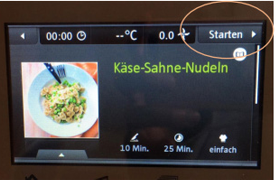
Start button
too small /
Color misdirection
Severity
5
Solution
Start button larger,
green background
Heuristic
Visibility of
system status
Consistency
and standards


Task
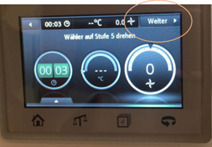
“Next” button misleading: time is beeing selected and it goes to the “Next” step automatically
Severity
5
Heuristic
User control
Error prevention
Solution
“Next” – option only
possible if level has
been set, only one
action per screen
Conclusion
You like it?
Take a look at my other projects
This was university group project. Thank you L.A and P.H!